Your portfolio returned 8% a year. Good news, but only half of it. The other half is what you had to sit through to get that 8%: how hard the value swung, how deep it fell, and whether the ride paid more than a risk-free bank deposit would have.
That is what portfolio risk metrics measure. This guide explains each one Portfellow calculates, in plain language first and formula second, with worked numbers, so you know what you are looking at the first time you open the Risk section of your performance report.
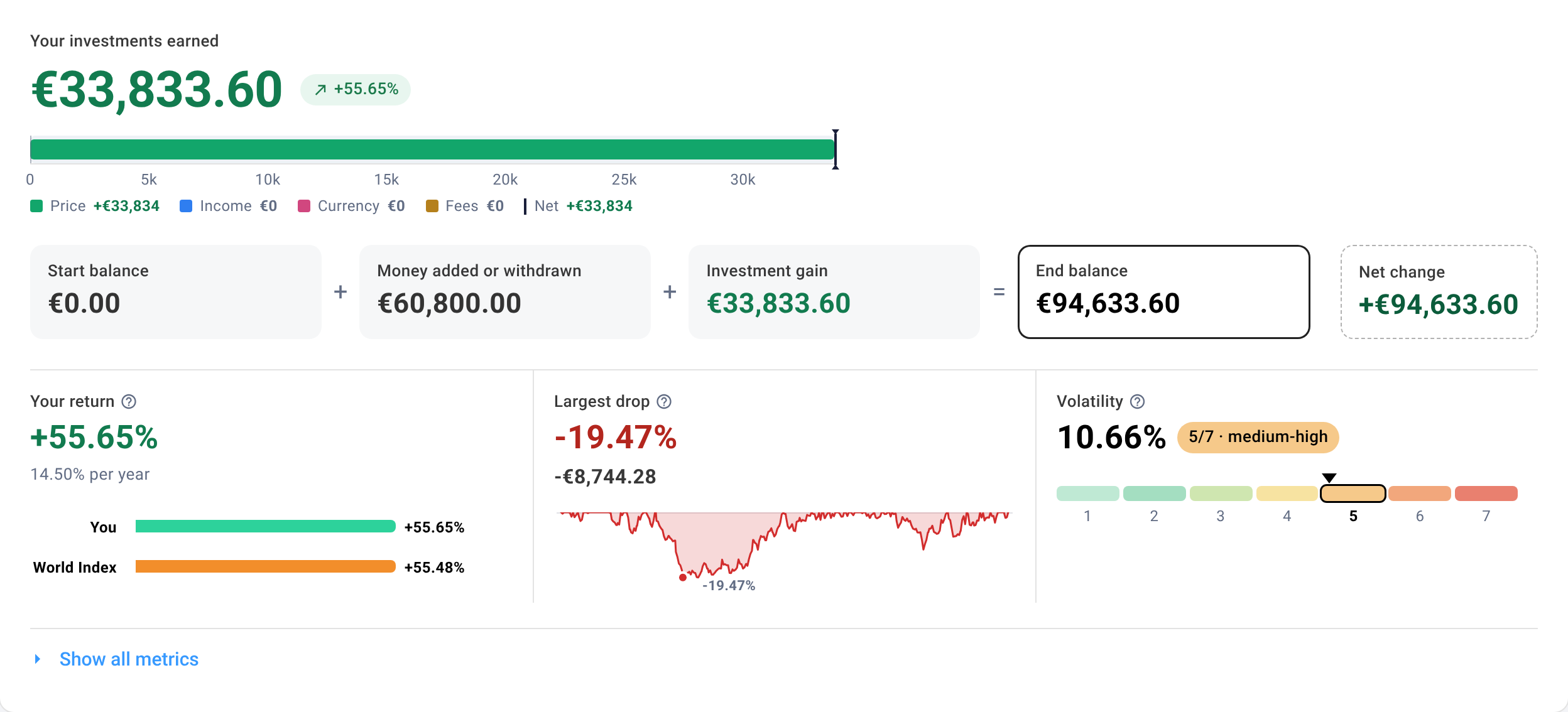
Why return alone is not enough
Take two portfolios that both returned 8% a year over five years. On the return line they look identical. Their risk metrics tell two very different stories:
| Portfolio A | Portfolio B | |
|---|---|---|
| Return per year | 8% | 8% |
| Volatility | 7% | 21% |
| Largest drop | −9% | −34% |
| Risk-to-reward ratio (Sharpe) | 0.71 | 0.24 |
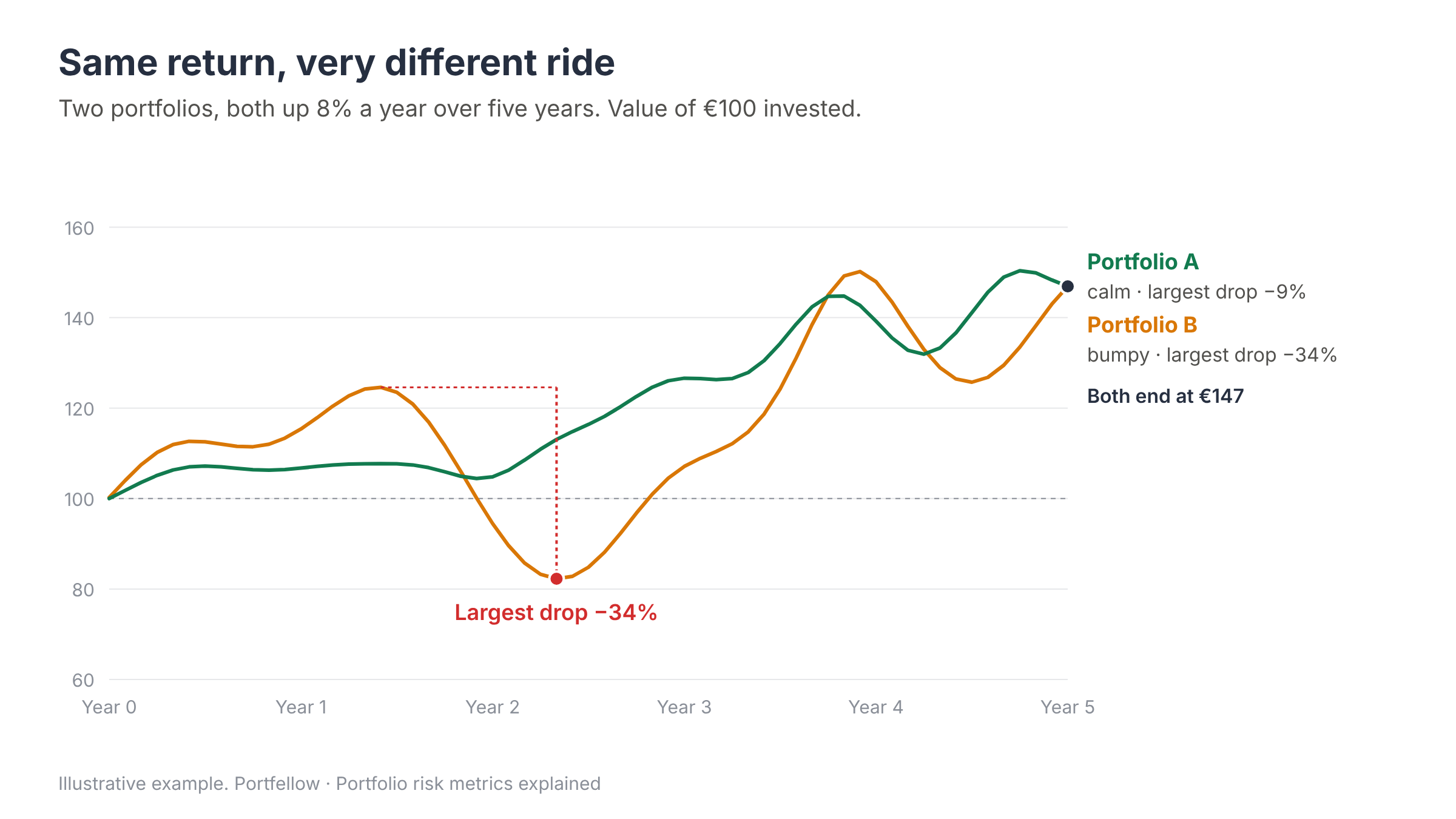
Portfolio A got there calmly. Portfolio B made its owner watch a third of their money disappear on the way, and got the same result. If you held Portfolio B, the real question is not "what did I earn?" but "would I have held on through −34%?" Many investors don't, and selling at the bottom turns a temporary fall into a permanent loss.
The three numbers to read first
1. Volatility: how bumpy the ride is
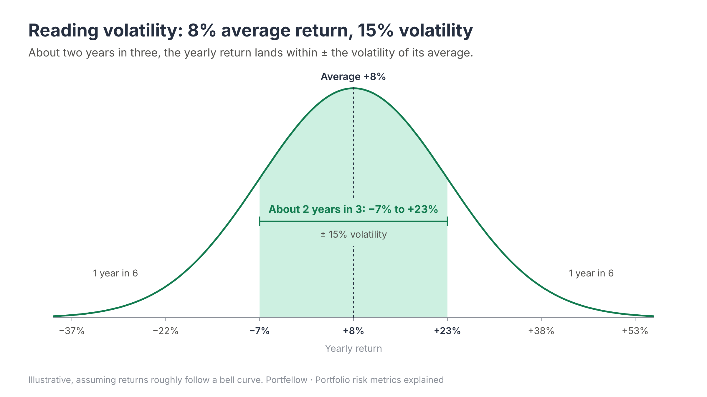
Volatility shows how much your return typically swings around its average, expressed as a yearly figure. Technically it is the annualised standard deviation of your portfolio's returns (monthly returns for periods of two months or more, daily for shorter ones).
How to read it: about two years in three, your yearly return lands within ± the volatility of its average. With an average return of 8% and volatility of 15%, a typical year falls somewhere between −7% and +23%. The other year in three falls outside that range, in either direction.
Lower volatility means steadier growth and calmer nights.
Higher volatility means a bumpier ride and wider outcomes, both good and bad.
What it doesn't tell you: whether you made money. A portfolio can be very calm and still lose, and volatility counts sharp rises as risk just like sharp falls.
The 1–7 volatility class. Next to the figure, Portfellow places your volatility on a 1–7 scale. It uses the volatility bands of the former UCITS fund key information document (KIID), the risk scale many fund factsheets used, so you can compare your portfolio with a fund you know. It is on the same scale, but it isn't the official risk indicator (SRI) in today's fund documents, which is calculated differently.
| Class | Volatility a year | Label |
|---|---|---|
| 1 | under 0.5% | lowest |
| 2 | 0.5–2% | low |
| 3 | 2–5% | medium-low |
| 4 | 5–10% | medium |
| 5 | 10–15% | medium-high |
| 6 | 15–25% | high |
| 7 | 25% or more | highest |
2. Largest drop (maximum drawdown): the worst fall you sat through
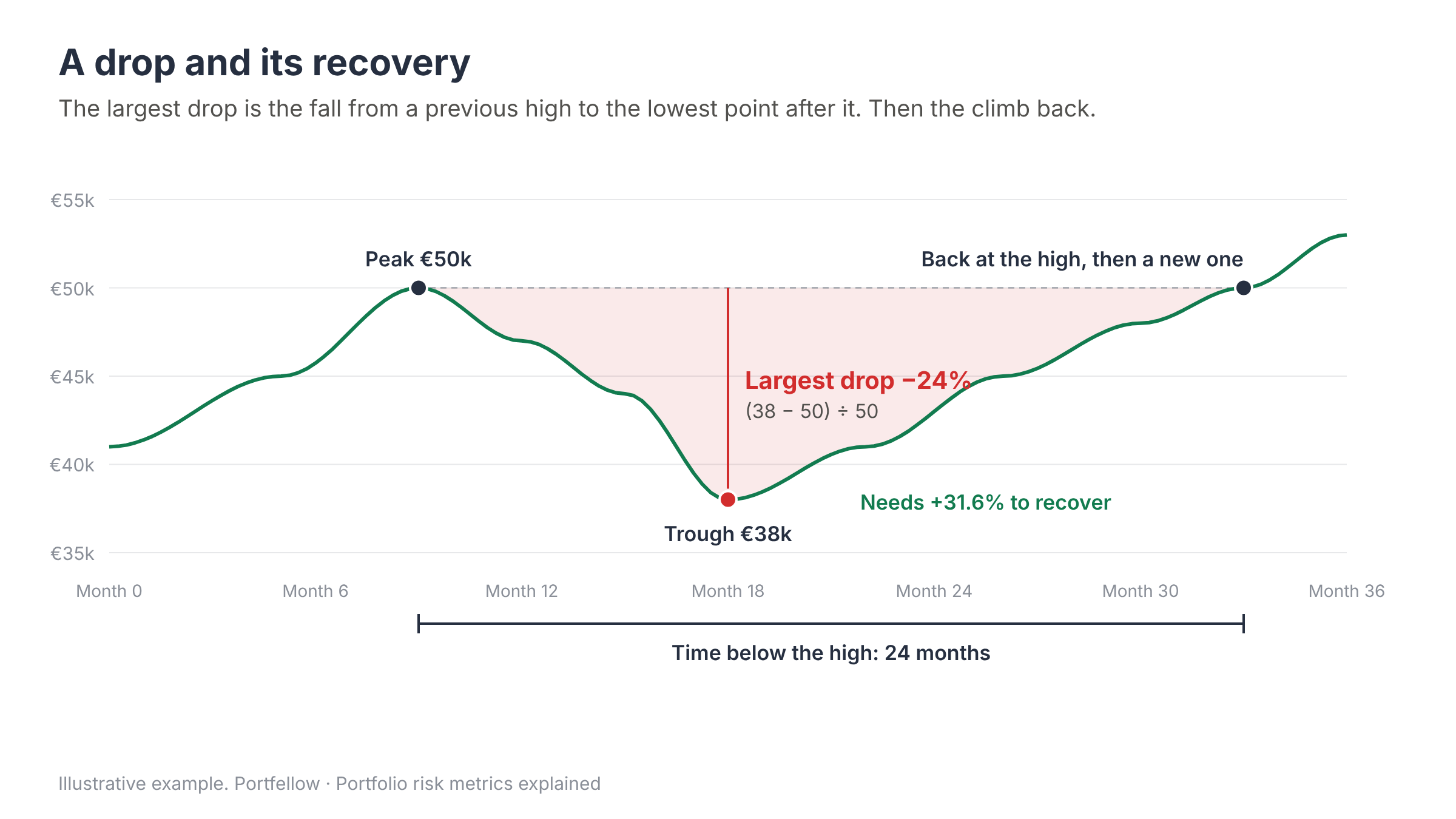
Largest drop is the deepest fall from a previous high to the lowest point after it, in percent. If your portfolio peaked at €50,000 and later bottomed at €38,000, the largest drop is (38,000 − 50,000) / 50,000 = −24%.
For most people this is the most intuitive risk number, because it is what losing actually feels like. Losses also hurt more than they look: after a 24% fall you need a 31.6% gain just to get back to the high. After a 50% fall you need 100%.
Portfellow shows a few related figures alongside it:
Largest loss in money: the same fall in euros (or your base currency), because −€12,000 often lands harder than −24%. Deposits and withdrawals are not counted as gains or losses.
Below your high now: how far below its previous high your portfolio is today. 0% means you are at a new high.
Longest time below a high: the longest stretch it took to get back to a previous high. It shows how much patience your strategy asks for.
Best and worst month, and the share of months up: the extremes and how often you ended a month with a gain.
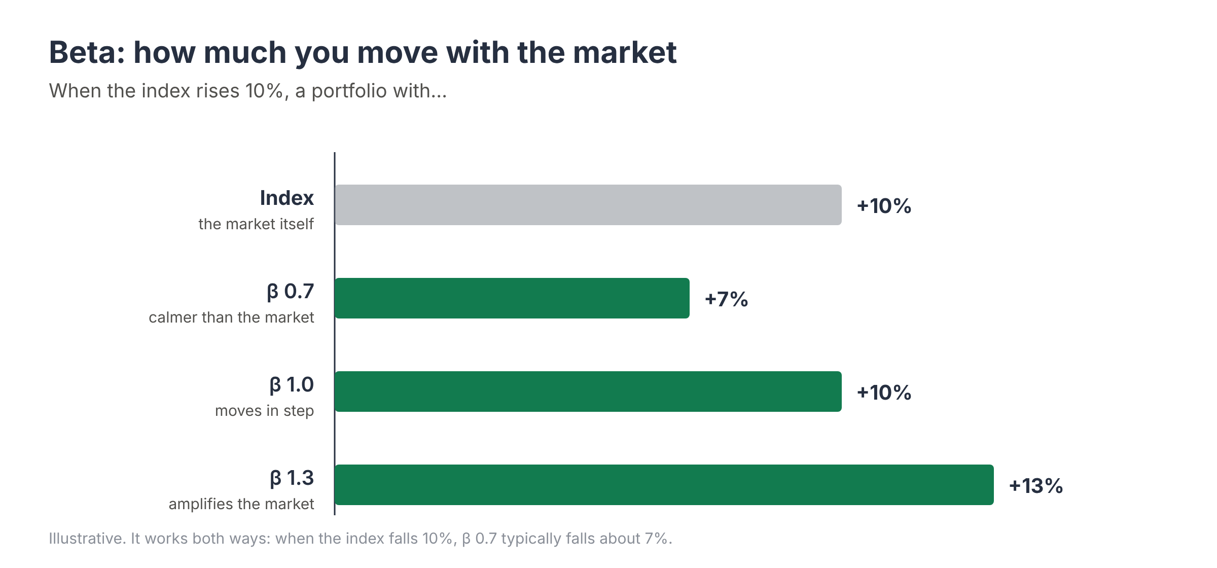
3. Beta: how much you move with the market
Beta measures how sensitive your portfolio is to the stock market. Portfellow measures it against a world equity index by default, and also against the S&P 500 and Nasdaq-100 so you can see which market you actually behave like.
Beta 1.0: you tend to move in step with the index.
Beta 0.7: when the index rises 10%, your portfolio typically rises about 7%, and it falls only about 7% when the index falls 10%. Calmer than the market.
Beta 1.3: you amplify the market's moves, about +13% for every +10%, and the same on the way down.
Beta near 0: your portfolio barely reacts to the stock market (think deposits, bonds, real estate).
Beta comes with a reliability check: How closely you follow the index (R², from 0% to 100%). At 90% the index explains almost all of your swings and beta is very meaningful. At 20% most of your movement comes from something else, such as local stocks, bonds, P2P loans or a few concentrated positions, and beta is only a rough guide. Beta needs at least 24 weekly or monthly returns; when the period you picked is too short, Portfellow measures it on the trailing 12 months and says so.
Did the risk pay off? Risk-adjusted return
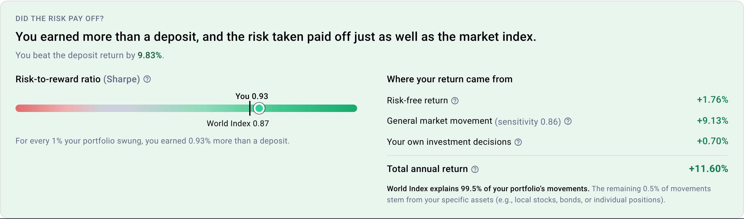
Risk on its own is neither good nor bad. What matters is whether you were paid for it. That is the question Portfellow answers at the top of the risk section: Did the risk pay off? It compares your result with two honest alternatives: a risk-free deposit, and simply holding the index.
Risk-to-reward ratio (Sharpe ratio)
The Sharpe ratio shows how much return above a risk-free deposit you earned for every unit of volatility:
Sharpe = (your return − risk-free return) ÷ volatility
With a 9% return, a 3% risk-free rate and 15% volatility: (9 − 3) ÷ 15 = 0.4. In plain words: for every 1% your portfolio swung, you earned 0.4% more than a deposit.
Below 0: a deposit would have earned more, without any risk.
Higher is better: more reward for the same swings.
Don't memorise thresholds. Compare yourself with the index: the tick on the scale in the app shows the index's own Sharpe over the same period. If you are to the right of it, your risk paid off better than passive index investing.
For the risk-free rate Portfellow uses real market data in your portfolio's currency: €STR, the euro short-term rate published by the European Central Bank, for EUR portfolios, and 3-month US Treasury bills for USD portfolios.
Where your return came from
Portfellow also splits your yearly return into three parts, so you can see what actually earned it:
| Part | What it means | Example |
|---|---|---|
| Risk-free return | What a deposit would have paid anyway | 3.0% |
| General market movement | What your market sensitivity (beta) earned as the index moved | 5.6% |
| Your own investment decisions | Picks, timing and fees compared with simply buying the index (alpha) | 0.4% |
| Total annual return | Your time-weighted return (TWR) | 9.0% |
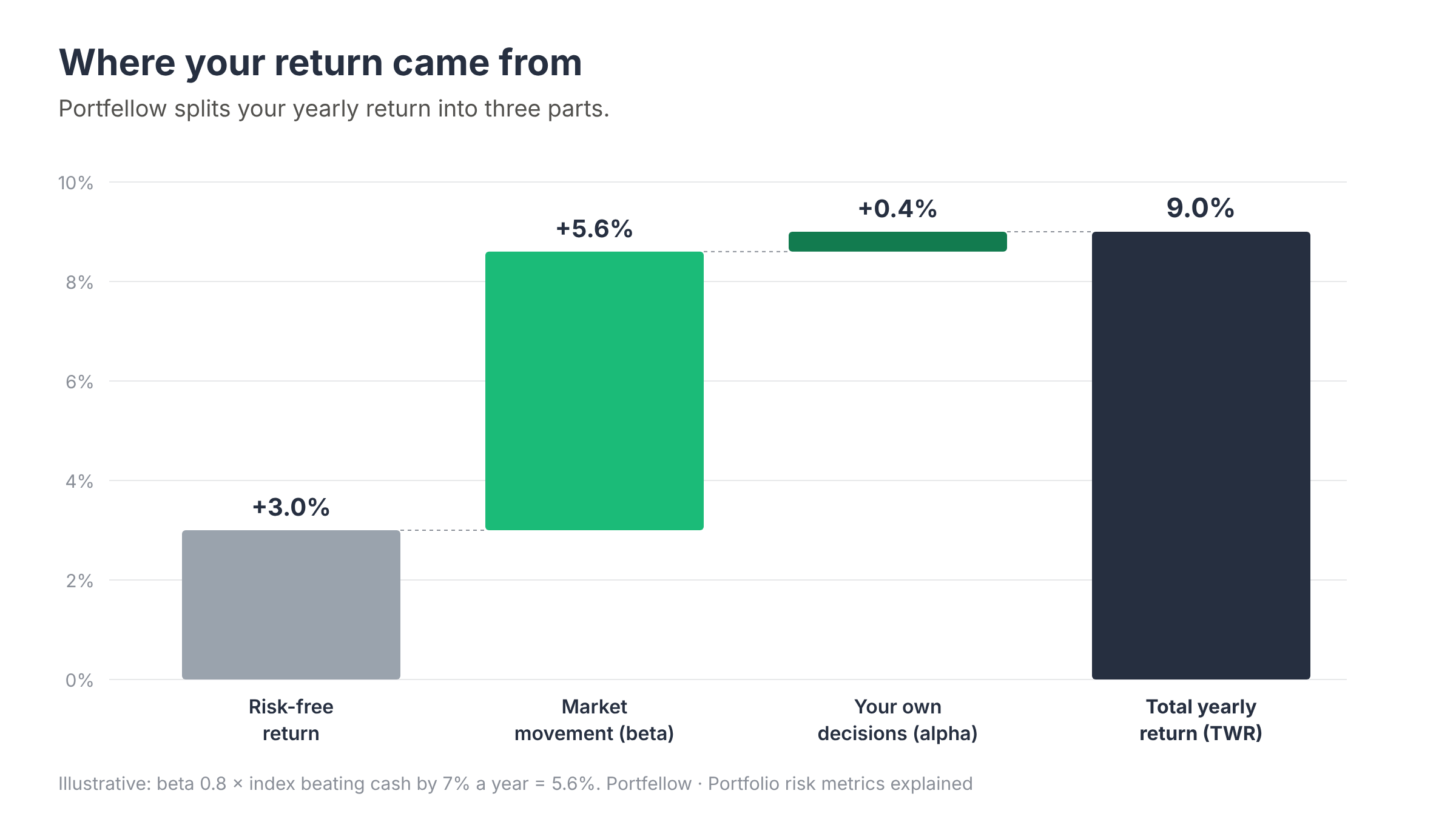
If "your own decisions" is consistently negative, the honest conclusion is that a low-cost index fund would have done the job better. If it is positive over several years, your choices are adding value. Note that this split is only reliable when the index explains a good share of your movement; Portfellow flags it as a rough estimate when it doesn't.
Advanced risk metrics, in one table
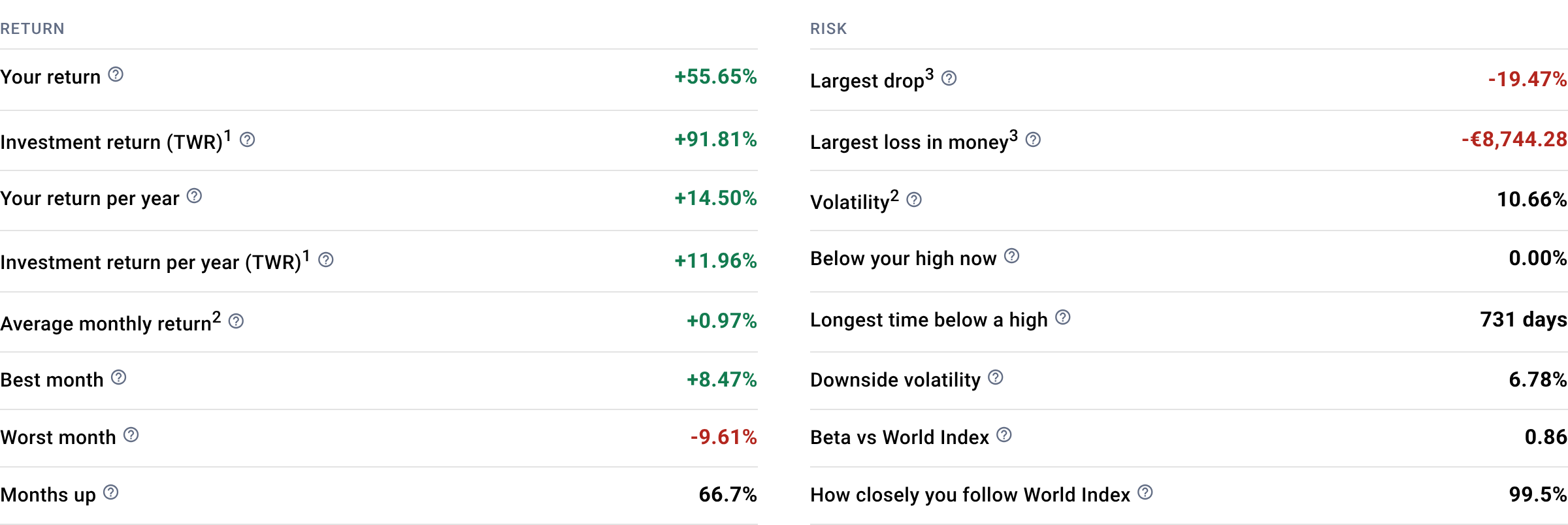
In the app, Show all metrics lists the return and risk figures side by side, and Show advanced metrics below them opens the full set. You don't need all of them, but each answers a specific question:
| Metric | The question it answers | Better is |
|---|---|---|
| Sortino ratio | Like Sharpe, but only falls below a deposit's return count as risk. Upside swings are not penalised. | Higher |
| Calmar ratio | Yearly return divided by the largest drop: did the painful falls pay off? | Higher |
| Treynor ratio | Return above cash for each unit of market risk (beta). | Higher |
| Alpha | Return the market's moves don't explain. Includes picks, timing, fees and luck. | Above 0 |
| Tracking error | How far your return typically strays from the index each year. | Neither: small = index-like, large = active |
| Information ratio | Did straying from the index pay off? | Positive |
| Months ahead of the index | In how many months you beat the index. | More |
| Upside capture | How much of the index's gains you kept when it rose. 100% matches it. | Higher |
| Downside capture | How much of the index's losses you took when it fell. | Below 100% |
| Capture ratio | Upside capture ÷ downside capture. | Above 1 |
| Correlation | How closely your ups and downs line up with the index, from −1 to 1. | Neither: lower = more diversified |
| Downside volatility | Volatility counting only the bad periods, below a deposit's return. | Lower |
How to use risk metrics: a five-minute routine
Look at a long enough period. Twelve months is the minimum for meaningful risk figures; three to five years is better. A few calm months say very little.
Compare, don't judge in a vacuum. 15% volatility is normal for a global equity portfolio and high for a bond-heavy one. Read every figure next to the index figure the app shows beside it.
Check your largest drop against your nerves. If the worst fall made you want to sell, lower the risk while markets are calm: add bonds or cash, or trim the most volatile positions.
Read volatility and correlation together. High volatility with low correlation to the index usually means a few concentrated bets are driving your results. Decide whether that is intentional.
Ask whether the risk paid. A Sharpe below the index's, or consistently negative alpha, is a clear signal that a simpler, cheaper portfolio would have done as well.
Common mistakes when reading risk metrics
Thinking low volatility means safe. Cash has almost no volatility and still loses to inflation. Assets that are priced rarely, such as real estate, P2P loans or private holdings, also look smoother than they really are, because a price that is updated once a quarter can't swing day to day.
Judging on short periods. One quarter's figures are mostly noise. Portfellow tells you when it based a figure on only a handful of returns.
Letting deposits blur the picture. When you add money, a broker dashboard can make your portfolio look like it "grew". Portfellow measures risk on time-weighted returns, so your own deposits and withdrawals never count as gains, losses or swings.
Treating the past as a forecast. Risk metrics describe what happened. They are the best map you have of a strategy's behaviour, not a promise of the next year.
Why these numbers are only as good as your data
Risk metrics need a complete, clean history of the whole portfolio. If half of your investments sit at another broker, in a pension fund or in a holding company, the volatility and drawdown of the part you can see say little about the risk you actually carry.
That is the problem Portfellow is built for: everything you own, across banks, brokers, pension funds, real estate and holding companies, in one view, with independent return math (XIRR and TWR) underneath. Sync gathers your transactions, you confirm them, and the risk figures are calculated on top of the full picture.
Past performance does not predict future returns. This article is educational and is not investment advice.