Hey 👋
Over the past month we’ve continued improving Portfellow to make portfolio tracking clearer, more customizable, and more insightful.
Here are the biggest updates.
🎨 More customization for your portfolio view
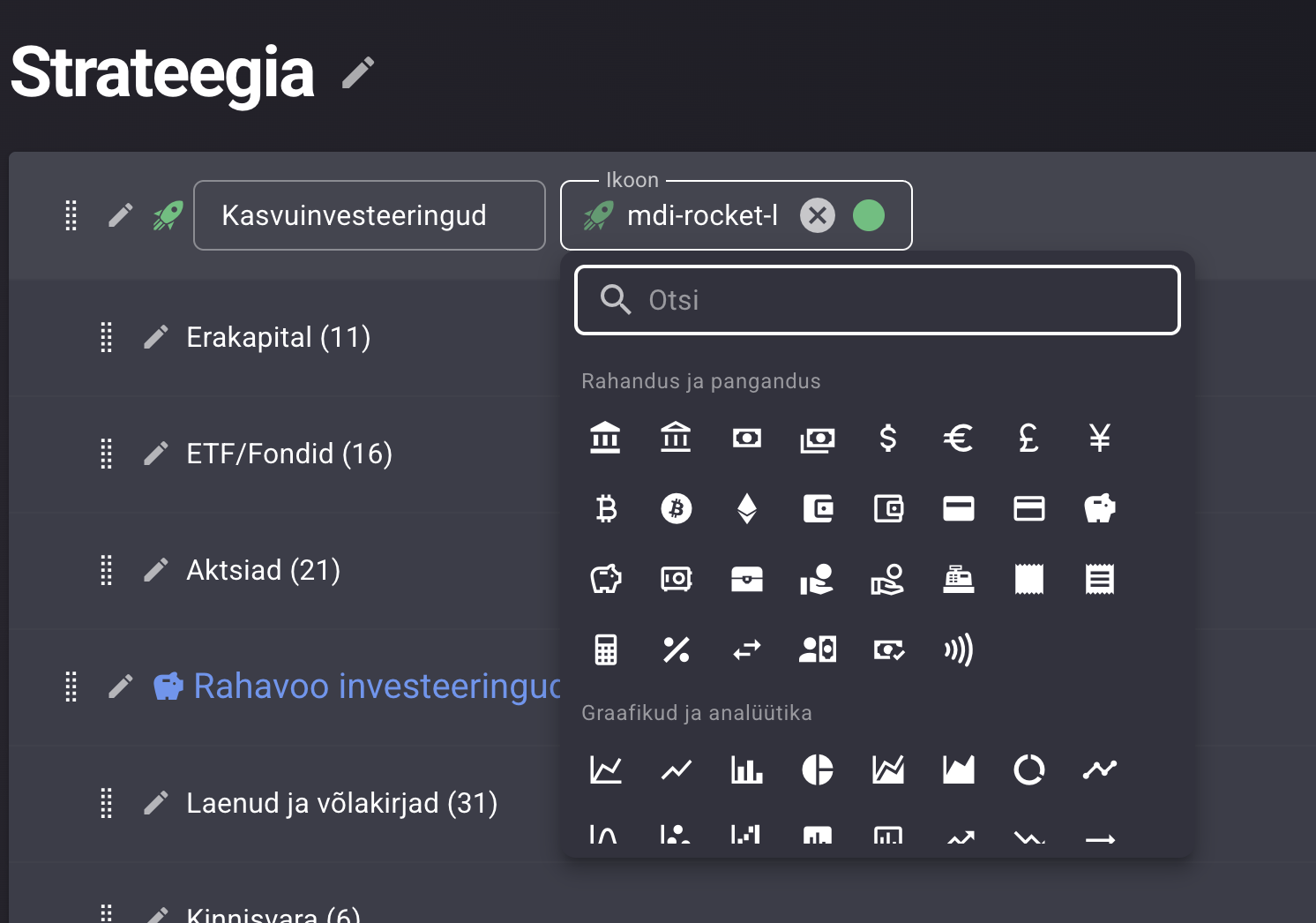
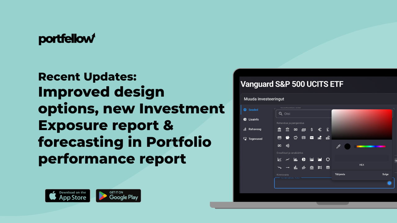
We’ve introduced several new design and appearance options so you can tailor Portfellow to your preferences.
You can now:
Configure how performance numbers are displayed in your account view
Add colors and icons to categories in Custom Views
Assign a custom color and icon to individual investments
This makes navigating large portfolios much easier and helps visually group investments by strategy, asset class, or personal preference.
A portfolio overview should feel personal — and now it can.
🔎 New report: Real investment exposure
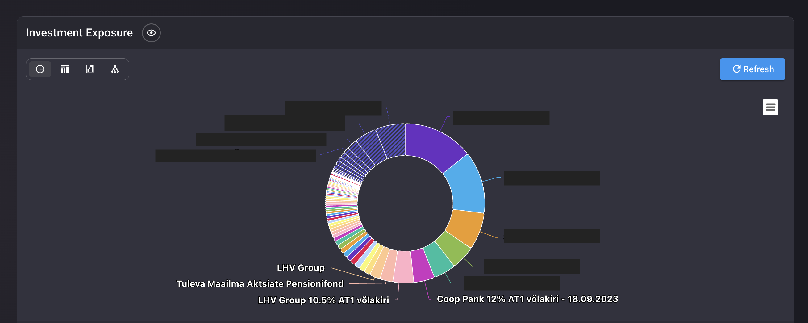
This feature quietly launched recently, but it’s a powerful addition.
The Investment Exposure report reveals the real underlying companies behind your funds and ETFs.
Instead of only seeing the ETF itself, you can now understand:
Which companies you are actually exposed to
How concentrated your portfolio really is
Where hidden overlaps between funds may exist
For investors using multiple ETFs and funds, this report provides a much clearer picture of your true portfolio allocation.
📊 Portfolio performance forecast
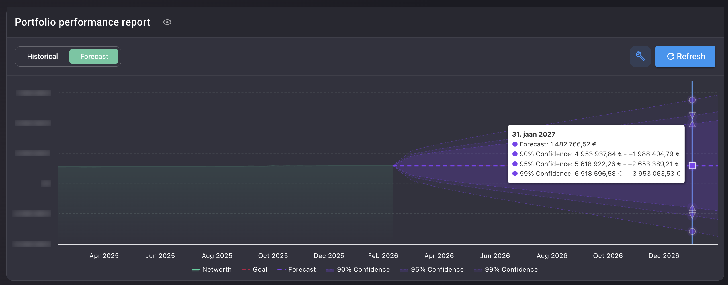
We’ve now made the forecast view in the Portfolio Performance Report publicly available.
This feature models potential portfolio outcomes based on historical volatility and return assumptions.
You can see:
Expected portfolio growth trajectory
Probability ranges with confidence intervals
Different possible future outcomes for your portfolio
Instead of looking only at past performance, you can now explore what the future might realistically look like.
Of course, forecasts are not predictions — but they can be a powerful way to understand risk and long-term potential.